England already has a national “league table” of deprivation. It’s useful. It’s also late. By the time an area has “proven” itself as deprived in the official stats, the costs are already embedded: school absence, family breakdown, rough sleeping, acute mental health demand, arrears, evictions, A&E pressure, antisocial behaviour.
The opportunity is obvious: councils don’t need another score that tells them who lost last year. They need an early-warning index that tells them who is about to lose next.
What the UK “poverty score” actually is
What people loosely call a “poverty score” is usually the Index of Multiple Deprivation (IMD) and related measures. It’s not a single poverty number. It’s a ranking system built from multiple domains that are strongly correlated with deprivation: income, employment, health, education, crime, housing/services, and living environment (with some adjustments and sub-indices).
The important part is the shape of the output: it behaves like a league table. Areas (typically small neighbourhood geographies) are ranked relative to each other. Councils then inherit a map of “where the worst is”, and central government inherits a way to justify targeting or compare places.
That ranking is why it can feel like a bell curve even when it isn’t presented as one. Someone has to be in the bottom 10% by definition — even if national living standards rise, the bottom decile still exists. That’s not a flaw. It’s the point. But it explains why some places always feel like they’re “missing out”.
Why it can punish “fine-on-paper” towns
This pattern shows up most clearly in places anchored by one or two strong sectors. A high-value industry can lift average pay and employment figures enough to mask underlying fragility, while specific neighbourhoods continue to experience persistent low incomes, poor health outcomes, weak skills progression, or mounting housing pressure.
In a league-table world, “not catastrophic” can be indistinguishable from “coping fine”. That’s how places with real stress end up competing against places with visible collapse — and losing.
There’s another distortion too: anywhere outside the London bubble can look “better” on housing affordability, even while household finances are quietly deteriorating through debt, insecure work, or rising private rents. If your benchmark is London, the rest of the country can look deceptively healthy.
What councils can actually do to drag an area up
The honest answer: councils can’t “fix deprivation” with a single lever. They operate on the margins of a system shaped by national tax policy, welfare rules, housing market structure, labour demand, public health, policing and education.
But councils can change trajectories, and trajectory is the whole point of early-warning. Councils can act earlier and cheaper by:
- preventing arrears and eviction spirals before they hit homelessness services
- targeting skills and employment support to the right micro-areas instead of blanket programmes
- front-loading family support where school absence and safeguarding risk are rising
- spotting health strain early (GP pressure, mental health demand, substance harm indicators) before acute escalation
- coordinating enforcement and support where anti-social behaviour (ASB) and community stress are trending up
- designing place-based interventions that match what is changing, not what is historically true
The difference between “superficial number” and “useful instrument” is whether the metric changes decisions. A backward-looking league table is good for storytelling and bids. A forward-looking index is good for operational leadership.
The problem with league tables: they measure status, not momentum
A deprivation ranking tells you where deprivation is concentrated. It does not tell you where pressure is building. Those are not the same thing.
If you care about outcomes, you should care about two questions:
- Where is it bad?
- Where is it getting worse, quickly?
The second question is the one that saves money — because it’s where intervention cost is lowest. Once an area has tipped, the unit economics are brutal. Prevention is cheaper than response. Early-warning is how you buy prevention at scale.
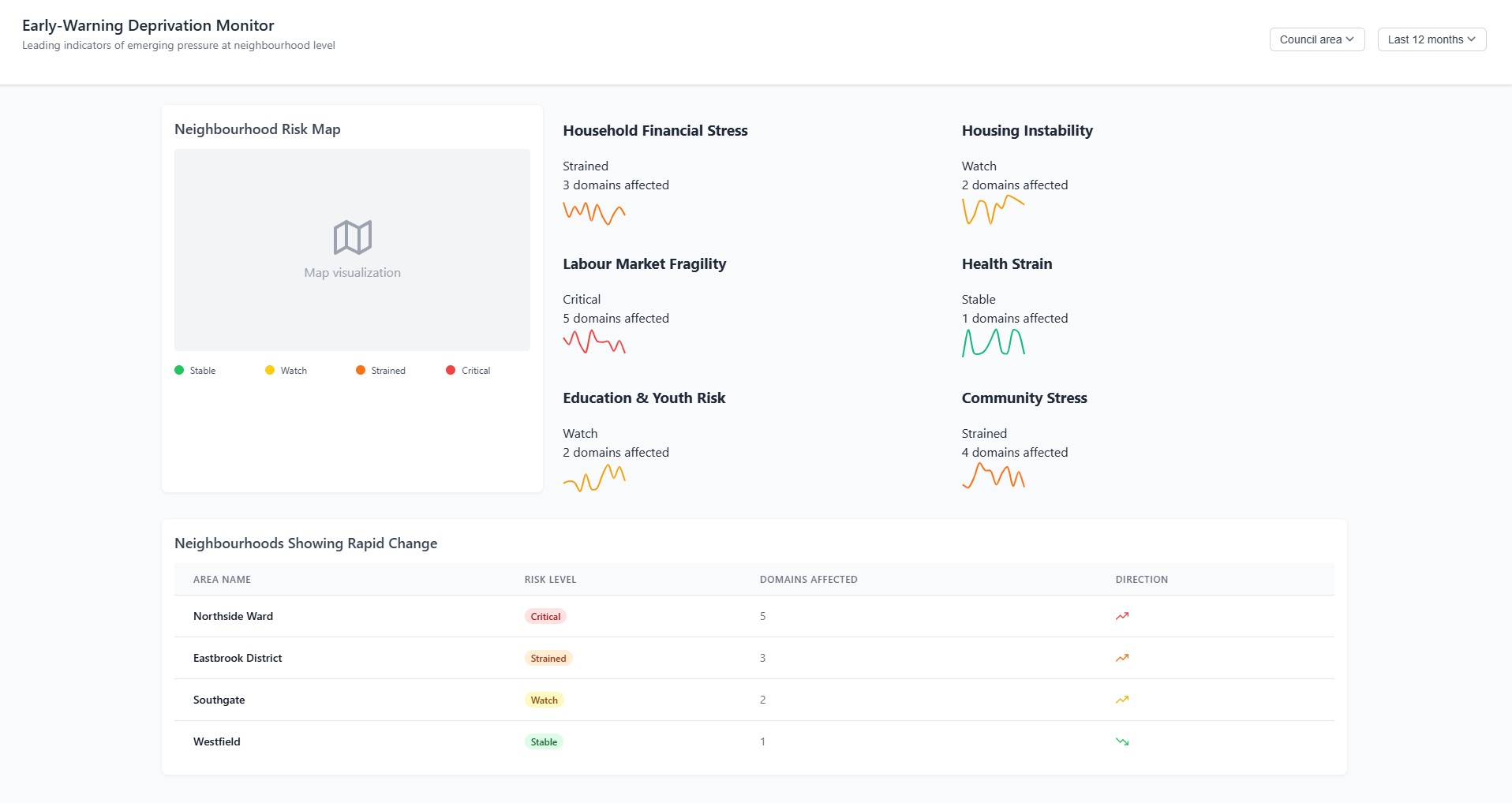
What an Early-Warning Deprivation Index would look like
An early-warning deprivation index does not need perfect data to be useful. What it needs is frequency, consistency, and triangulation. Individually weak signals become powerful when they move together in the same direction, especially when they are tracked at neighbourhood level and updated often.
The index shouldn’t replace the existing deprivation measures. It should sit on top of them: a “pressure layer” that detects emerging risk at neighbourhood level and flags rapid change.
Think in domains that councils recognise operationally:
- Household financial stress (arrears, debt stress proxies, discretionary spend compression, crisis support demand)
- Housing instability (rent pressure, evictions, temporary accommodation flow, homelessness presentations)
- Labour market fragility (insecure work exposure, layoffs by sector, claimant flows, underemployment signals)
- Health strain (mental health demand, substance harm indicators, A&E pressure proxies)
- Education & youth risk (persistent absence, exclusions, NEET risk, safeguarding pressure)
- Community stress (ASB incidents, violence patterns, complaints, environmental disorder indicators)
Then score change, not just level: month-on-month and quarter-on-quarter shifts, adjusted for seasonality. The output isn’t “this area is deprived”. The output is “this area is deteriorating across multiple domains” — the early warning that lets you act before it becomes visible in the official league table.
Why councils would actually pay for this
Councils don’t pay for data because it’s interesting. They pay for it when it changes one of three things: cost, risk, or accountability.
An early-warning monitor does all three.
- Cost: earlier intervention is cheaper intervention. A system that reliably reduces temporary accommodation growth, crisis spend, and acute escalation pays for itself quickly.
- Risk: councils carry statutory risk — homelessness duties, safeguarding exposure, serious incident fallout, reputational damage. Early-warning is a risk-reduction tool, not a “nice-to-have dashboard”.
- Accountability: elected leadership needs defensible prioritisation. “We targeted these wards because the pressure indicators were moving fastest” beats “we guessed” or “we followed last year’s map”.
The real commercial angle is that councils already buy systems in the name of “transformation”. Most of those systems digitise workflow. This one improves decisions. It becomes the layer that tells you where to deploy the workflow you already own.
This isn’t a new score. It’s a new instrument.
The best way to think about it is not as another deprivation index, but as an instrument panel. IMD tells you where the engine has been running hot for years. Early-warning tells you the temperature is rising right now.
Councils don’t need more morality tales about deprivation. They need control surfaces: signals that move early enough to change what happens next.